Source: https://krass.com.au.Krass magazine. License: All Rights Reserved.
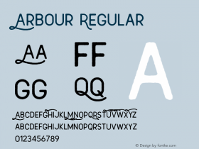
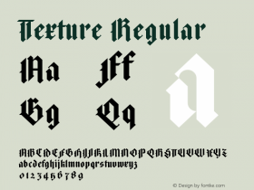
The website for Issue 1 usesHarbour. For Issue 2,Textwas used as the headline font. Issue 1 had a red theme, Issue 2 blue.
Like the magazine the website has a bold, immediate design. The open-spaced caps headlines have some uneven letter spacing. Use of title case setting for smaller type adds colour and texture to the layout.

Source: https://krass.com.au.Krass magazine. License: All Rights Reserved.

Source: https://krass.com.au.Krass magazine. License: All Rights Reserved.

Source: https://krass.com.au.Krass magazine. License: All Rights Reserved.

Source: https://krass.com.au.Krass magazine. License: All Rights Reserved.

Source: https://krass.com.au.Krass magazine. License: All Rights Reserved.